What'sNew
Check here for all the latest Surfline updates.
Buoy swell spectra
January 16, 2024 / Back to top
January release: Get down to the nitty gritty of buoy data.
New buoy swell spectra graphs show how swells are interacting in real time.

We’ve just shipped buoy swell spectra graphs, which show the distribution of swell energy over a given period and will help you understand what surf conditions to expect as a result. Some surfers, including those used to the MSW interface, consider this feature to be even more valuable than our cams—and you know how much we love our cams.
When and how you’ll use buoy swell spectra (and what it looks like).
Let’s say you know that your local beach break likes combo swells, while your local point break prefers clean, long-period swells. You wake up before dawn and check the buoys, using buoy swell spectra to see that there are two distinct swells in the water—3 feet at 16 seconds from the southwest, and 4 feet at 10 seconds from the northwest—which spot are you going to surf? The beachie that likes combo swells, of course.
When looking at the buoy swell spectra graph, that combo swell would be shown with a wide distribution of energy across swell periods (a gradual, wider curve in the graph). Narrower, or more concentrated spectrum (shown as a spike or noticeable peak in the graph) means more organized and direct swell energy. You can learn more about different distributions in our blog about swell spectra.
Once you know what makes a spot hum, buoy swell spectra is a powerful tool that guides you toward good surf. So powerful, in fact, that our VP of Product and Innovation (as well as the founder of MSW), Ben Freeston, recently said the following in a meeting:
“If I had to choose between cams and buoy spectra to know what the waves are doing, I'd choose buoy spectra."
Where to find it.
To try out buoy swell spectra on iOS, visit the explore tab, scroll down, and toggle to buoys.
You can also scroll to the bottom of a spot page and click on your local buoy (all platforms). You’ll find the spectra graph below the latest readings and reported data graph.
Observed vs. forecasted metrics.
If you’ve checked Surfline on the web, you may have seen our recently shipped feature, swell spectra graphs on spot forecast pages. Those graphs show forecasted conditions, while buoy swell spectra offers observed data, which is raw and nearly real-time data. Soon, you’ll be able to check forecast swell spectra graphs on iOS as well.
We get that these concepts aren’t as simple as the, “Wake up, check the report, check the cams, go,” routine that many surfers (including some of the team here) follow. But for some, buoys are a key part of surf planning—and buoy swell spectra will greatly enhance that experience.
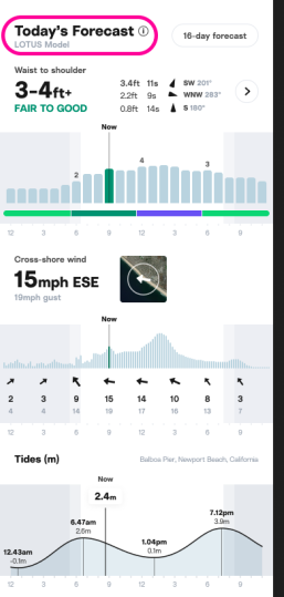
LOTUS
January 31, 2024 / Back to top
Get to know our proprietary swell model, LOTUS.
The in-house swell model that powers all our forecasts (now with fancy labels).
How we got here.
The science behind surf forecasting is, as we all know, a complex process that involves a lot more than the forecast team looking at a crystal ball. In short: swell models are a computer-generated forecast calculated from data collected in the ocean and atmosphere. Over the years, we’ve developed custom, surf-specific models to predict surf and provide our forecasters with a foundation for their outlooks and reports.
In 2001, Surfline founder Sean Collins created LOLA, a first-of-its-kind swell model that combined satellite data with bathymetry (underwater mapping) and nearshore buoy data to produce a user-friendly surf forecast, updated every six hours.
In the last few years, we retired LOLA and introduced LOTUS—which still uses similar data, but also incorporates new tech, like machine learning, to provide even more accurate model resolution, at an hourly rate. LOTUS performs billions of calculations an hour to predict how wind will make waves and how the waves will evolve. This data is used to populate various conditions, graphs, and tables at any given spot. It’s also been constantly learning and growing since its implementation, meaning that the forecasts you see today are even more precise than those you saw a few weeks ago, and tomorrow’s will be even better.
What makes it different?
A key difference between our proprietary swell models and other marine forecasts out there is that LOTUS was built specifically for surfers, focusing on how waves will be breaking at the beach, rather than what’s happening out in the open ocean. It uses machine learning to teach itself to be more accurate over time, continuously improving.
LOTUS taps into 35+ years of Surfline historical data and uses a unique combination of satellite assimilation, high-res bathymetry mapping, and forecaster input to validate and train it. The result? The most accurate and up-to-date surf height forecast available.
So, is it new?
Nope. We launched LOTUS in 2021, and it’s been evolving ever since. But we did recently add some labels to help you differentiate when the surf report includes forecaster observations or comes straight from the LOTUS model. If you see a LOTUS label, you’ll know that the info was generated by our model. If you see a forecaster’s avatar, you’ll know that one of our team members has observed the surf and updated the forecast accordingly.
While we’re confident that LOTUS is the best surf forecasting model available, any computerized model has the potential to get things wrong. That’s why our forecasters supplement the LOTUS reports with their observations—and why we’ll always keep our forecast team in-house.
Custom forecasts
January 25, 2024 / Back to top
Get a custom forecast for any given point in the ocean.
Here, there, anywhere.
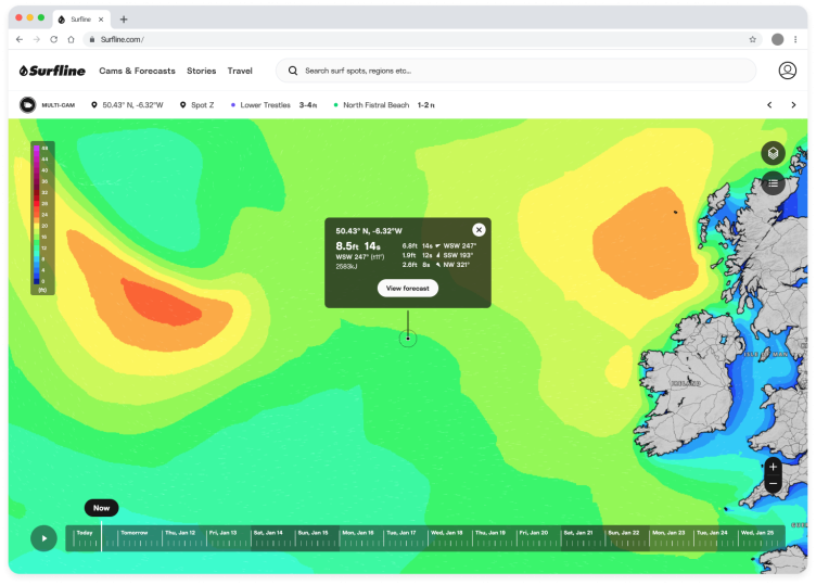
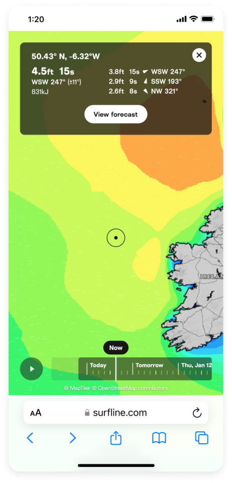
We pride ourselves on our forecast and cam coverage, but for some of you out there, your preferred spots can only be found off the grid or offshore. That’s why we’ve introduced custom forecasts, which allow you to pick any point on the map and get a 16-day swell, wind, and wave energy forecast.
If you are a Premium member, can try out custom forecasts on web by clicking here.
How should I use it?
On web, go to “Cams & Forecasts” and then “Charts,” and navigate to whatever off-the-beaten-path beach or offshore spot you’re planning to surf.
You’ll see a tooltip pop up; when you drag it and click down, current conditions will pop up, and you can click “View forecast” to get the 16-day outlook.
You can save your favorite points for quick checks—just go to your forecast outlook (click “View all” when looking at your Favorites) and they’ll appear under “Custom forecast.” And before you worry about blowing up the secret spot: this custom forecast will only be visible to you, unless you decide to share it with a trusted friend.
Inside tip: if the geographic coordinates for the custom forecast you’ve saved aren’t exactly where you want them to be, you can edit them by clicking on “Edit spot” in the upper right corner.
Is this useful for spots Surfline already covers?
This feature is most helpful for any spot that doesn’t already have a Surfline forecast. If you are interested in a geographic point that happens to also be a Surfline-covered spot, you’re better off getting juicier details and the outlook from our team by looking at that spot’s Surfline forecast.
Swell spectra

With some swells, there’s more than meets the eye.
New from Surfline Labs: swell spectra graphs give you a deeper insight into where energy is concentrated.
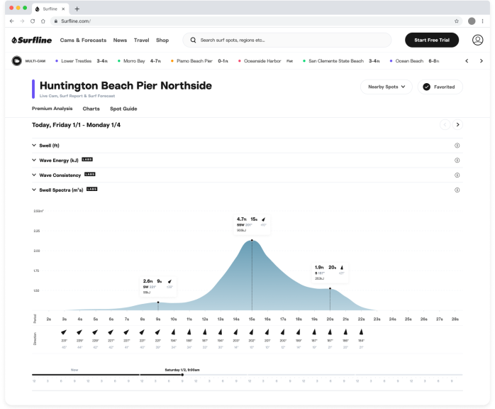
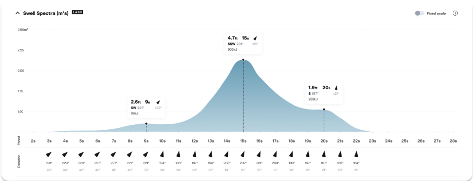
Every wave in a swell breaks differently. Waves within one swell range in size and period, so when we say, “six foot at 13 seconds,” we mean that the average height of the largest third of waves is six foot, and the most energetic waves are around 13 seconds apart.
You might be used to reading the Surfline swell graphs to understand where wave energy is concentrated, but we all know from experience that two days (or even two hours) with six foot at 13 second swells can result in a different experience in the water.
Swell spectra shows you not just the averages (the peaks on the spectra graph), but where all the energy is distributed in a swell. For MSW fans, this graph should look and feel familiar.
How to use swell spectra to understand surf conditions.
Concentrated spectrum
In this example, nearly all of the energy is concentrated across a small number of wave periods, so this is a very concentrated spectrum. Concentrated energy is usually associated with less consistent swell (i.e. longer breaks between sets of waves), so you can expect there to be more waves in a set, and for the waves to be more organized and uniform in terms of shape and size.
Wider spectrum
Above, the energy is distributed across many wave periods, creating a wider spectrum. The peak of the spectrum is still ‘sharp’, so you’ll observe a good amount swell associated with the 16-second wave period. But overall, the wider distribution means both shorter period and longer period waves will be in the mix, leading to conditions that will likely be a little bit mixed up and disorganized, but consistent. This is a great example how the ‘peak’ we list elsewhere may not always give the whole picture.
Missing swells
Sometimes, the wave model has difficultly identifying the separate swells in the wave spectrum. With this example, the wave model has only identified and listed one swell, because there aren’t clear individual peaks. The spectrum provides the full picture, which shows a significant energy in the shorter periods, which will likely create mixed up and choppy surf.
In this situation, a small change in the energy at seven seconds could cause the ‘peak’ to jump down from 12 seconds. You see this happen quite a lot in the forecast, and the swell spectra can help explain that the surf doesn’t necessarily change as much as expected in that scenario.
Graph key
Spectral wave density*: y-axis
Wave periods: x-axis
Mean wave direction at each period: arrow and degrees in black
Mean spread of direction: degrees in gray
Partition wave height: see tooltips at peaks
*Spectral wave density represents the distribution of wave energy across the different periods.
Why did we build this?
Swell spectra is part of our effort to give you everything you need to get involved with the forecasting process, so you can dig a little deeper and know exactly how swells will be affecting the spots you want to surf. Many Surfline members want deeper access to the data behind our surf height predictions so they can make their own determinations about surf conditions at that spot—or nearby secret spots.
Where can I find it?
Find this graph at the bottom of every spot page under “Swell Spectra”. Available now on web to Premium and Forecast members, coming soon to iOS and Android.
Everything else you need to know.
As a Surfline Labs feature, swell spectra graphs are still in their early phases, and the UI and data models behind it may continue to evolve as we test it out and receive feedback from members. Feel free to reach out with your thoughts at feedback@surfline.com.
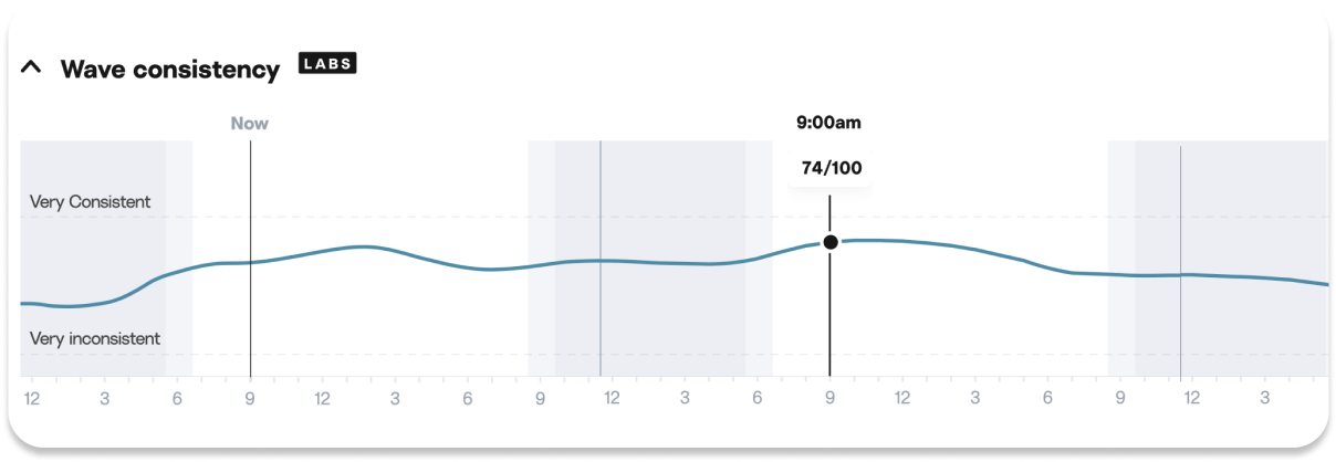
Wave Consistency
How’s your wave count?
Our new Wave Consistency metric predicts just how long it might take to get a couple of fun ones.
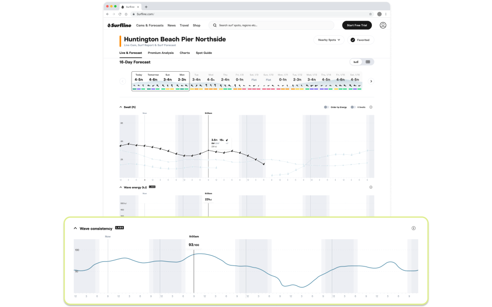
Will it be pumping or lully? Wave Consistency will tell you.
We’ve all experienced those sessions where it feels like there are more than enough waves to go around, as well as those days where you’re waiting for ages between sets.
We’ve developed a new metric, Wave Consistency, to predict how regular the set waves are at a specific spot to give you an idea ahead of time.
How should I use it?
Consistency helps you to make the most out of a session—choosing the right spot, picking the right board, or adjusting your spot in the lineup—by giving you a sense of how consistent set waves will be.
The higher the number, the more sets and waves you can expect. It can also help you determine how intense the paddle out will be and whether you’ll be able to take advantage of lulls to sneak out the back.
How does it work? What’s behind the metric?
Wave Consistency predicts the frequency of waves every hour, at every spot, on a scale out of 100. For example, if the score is 20/100 it might feel a bit slow or lully. If the score is 80/100, your chances of riding more waves (or copping more sets on the head) are higher.
We’re putting a value on how “setty” the surf will be and how many waves there will be in a set. We derive this from our wave model, LOTUS, by predicting how many waves will exceed a certain wave height threshold for that spot. The higher the score, the more often that threshold has been exceeded (more sets).
The scale is standardized across spots, so you can compare Wave Consistency at your favorite breaks, along with swell height, wind, and tide before you head out.
Where can I find it?
Find this metric at the bottom of every spot page under “Wave Consistency”. Available now to Premium and Forecast members.
Everything else you need to know.
As a Surfline Labs feature, Wave Consistency is still in its early phases, and the UI and data models behind it may continue to evolve as we test it out and receive feedback from members. Feel free to reach out with your thoughts at feedback@surfline.com.
FAQ
Can you have a 4ft surf height with a low and high Wave Consistency number?
Yep, the Wave Consistency score can vary even if the forecasted surf height remains the same.
You’re predicting a high wave consistency but it’s huge and not surfable - what’s the deal?
The Wave Consistency metric predicts the frequency of the set waves and is not considering the quality of them. Our forecasts already provide information on height and quality.
It’s generally true that long-travelled swell of the sort surfers get excited about is often less consistent than short-period wind swells.
Why is the Wave Consistency score almost 0 but it’s not forecasted to be flat?
The score focuses on predicting the occurrence of set waves rather than all waves. This means that even when the forecast isn't entirely flat, the score may drop if these key set waves are few and far between – particularly in scenarios involving very short-period wind swells.
Aug 15, 2023 / Back to top
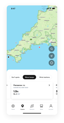
Explore map
Visualize how current conditions impact your spot.
More tools to help you know if it’s worth driving to the beach.
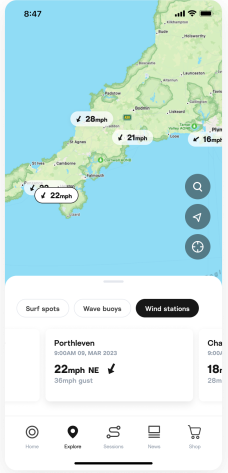
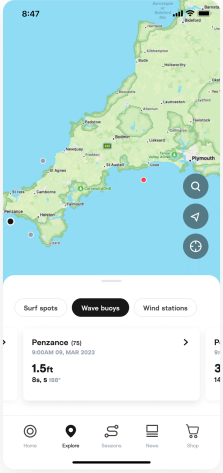
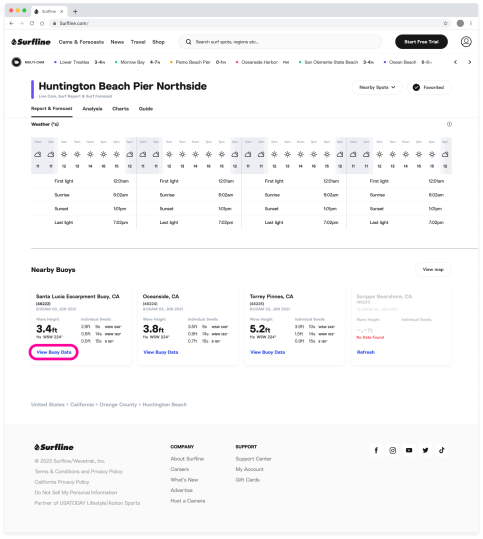
Our map view has always been a fun way to explore the coastline and find spots, but now it’s also a way to see the latest conditions. We recently added buoys and wind stations to the map view so you can easily visualize how current conditions are affecting your spot, and determine if it’s worth heading out:
Buoys - We’ve had buoys on our web map for a while, and they are now available on iOS as well. See where nearby buoys are in relation to your surf spots and click on them to get the latest observations.
Wind stations - With the addition of wind stations to the map, you can now see precisely where they are located and quickly view the latest reading. This allows you to feel confident about what the wind is doing near the spots you want to surf.
Where to find map features.
To check out these updates, click on the “Explore” tab in your iOS app and toggle between surf spots, wind stations, and buoys. Look out for this update on Android soon.
On web, click “Cams & Forecasts” on the navigation bar and then “Map.”
Wave Energy
Aug 9, 2023 / Back to top
Not all waves are created equal.
Wave Energy gives you more insight into how the waves will feel at your spot.
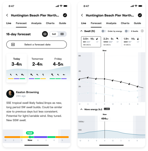
We are excited to have recently launched one of our most requested features of all time: Wave Energy. This new metric will help you fine-tune your surfing decisions by giving you more information on the swells you’re checking out and how the waves will feel at your spot.
What is Wave Energy?
Wave Energy is a function of swell height and period, measured in kilojoules (kJ), a standard unit of energy. We show the energy that reaches your beach from deeper water offshore.
It helps you see how swell size, period and direction come together to create the waves you’ll surf. Comparing the Wave Energy on multiple days with the same surf height (e.g. 3-4ft) can highlight the effects of different underlying swells. Comparing different surf heights, you’ll notice that doubling the surf height will increase energy exponentially, which is a reminder of the power of large surf.
Energy can help you determine how the surf will “feel” and therefore, which board to take, or what to be mentally prepared for. Keep in mind that the depth of the water, the tide, and the sandbars or reef will affect how powerful the surf feels and the energy will also have an impact.
How should I use it?
Wave Energy can give you both a guide to how waves will feel at your spot and also an aid to understanding how swell height and period contribute to creating surf at your local beach.
If you are already an experienced forecaster we think you'll find Wave Energy a great 'at-a-glance' guide to spotting swells that matter to you. If you're new to using our more advanced data, Wave Energy is a stepping stone to starting to use other swell information to really understand how different ocean conditions contribute to the waves you like to surf.
In any case, as with everything we offer, we suggest you check the forecast and get in the water yourself—the easiest and most enjoyable way to learn how to use this data is by correlating it to your direct experience.
Everything else you need to know.
June 22, 2023 / Back to top
Going off grid? No signal, no problem.
Access spot data from anywhere with offline mode.
Sometimes, surf plans change, and when you get to your spot (or are on the way), you’ll want to double check forecasted tide and conditions—but phone service isn’t always available.
We’re glad to introduce offline mode to iOS (Android coming soon), so you can view spot info without loading new data. Just make sure you open Surfline and check that spot at home, or whenever you have WiFi or service, and it’ll stay loaded even without internet connection.
May 31, 2023 / Back to top
Historic forecast
Peek into the past—no clairvoyance required.
Historic forecast data shows you swell info dating back to 2010.
While we rely on the forecasts to help plan our upcoming surfs, some of the best insights can be found in the past. That’s why we’re introducing historic forecast data on Surfline. Now, you can search all the way back to 2010 (somebody queue up Train’s Hey Soul Sister) to relive swells, discover seasonal trends, and see if that spot really was better five years ago.
Historic forecasts: a history.
Historic forecast data was a favorite feature over on magicseaweed, so the members who have recently joined us from MSW should feel right at home. Longtime Surfline members have also been asking for this one for years, and we’re glad to be able to deliver.
How to view historic forecast data.
View historic forecast info at almost any spot by clicking the 📅 icon on the top right of the 16-day forecast.
Historic forecasts are currently available in our web, iOS 16+, and Android experiences, exclusively to Premium members.
Aug 1, 2023 / Back to top
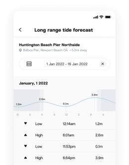
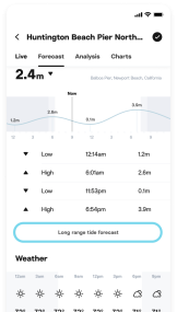
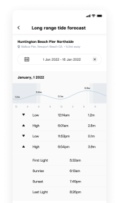
Long-range tides
Plan even further ahead.
Access over a decade of tide data.
You know those tide calendars you used to get at the surf shop, then promptly lose into the abyss of your car’s center console? They’ve gone digital, with long-range tide data available at all spots on Surfline.
How to use long-range tides.
Use long-range tides to check tides for upcoming surf trips, or to keep track of when that fickle, only-accessible-twice-a-year spot will be working.
View long-range tides up to 2037 (and back to 2010) in the tide section of the forecast by clicking on “Long Range Tide Forecast.”
Currently available on iOS 16+, Android and web to Premium members.
March 27, 2023 / Back to top
Surf ratings have a new look.
A fresh take on our ratings scale.
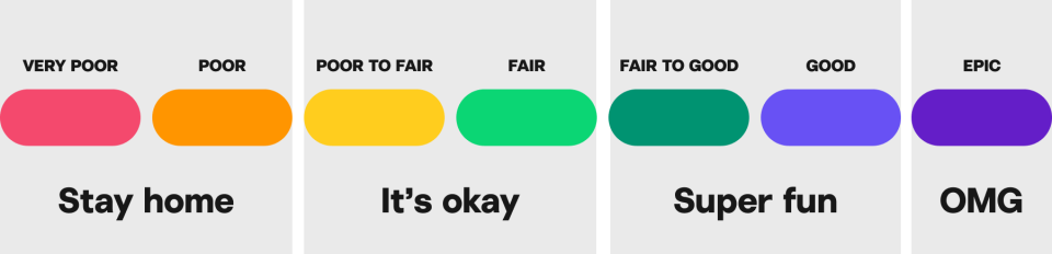
We’ve updated our surf rating colors to a “traffic light” pattern. Based on feedback we’ve gathered from surfers, this pattern is more intuitive for decision making, since it’s similar to other rating systems. Just like traffic lights, red means stop, green means go, and well, purple means…Pumping.
If you’d prefer to use the classic surf rating colors, you can switch to the classic view in your account settings.
Feel free to reach out to support@surfline.com if you have any questions or feedback for our team.
March 10, 2023 / Back to top
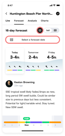
Forecast
Find your next surf faster with fresh new forecast pages.
We’ve recently launched a fresh new look for Surfline’s camera and forecast pages on the web to help you find the best windows to surf faster and easier. We’ve also added a new forecast table for those that prefer that view.
Introducing the Live tab: Do you want to surf now or later?
We’ve split the core surf spot page experience into Live and Forecast tabs to help you answer whether you should surf now (Live) or later (Forecast). On the Live tab, quickly check current conditions, cams, surf report, and the rest of today’s surf forecast.
We also moved the Best Bets and Forecast Highlights, where the Surfline Forecast team shares tips to score today and the best days to target in forecast, into the Live tab.
Find the best days of the forecast, faster.
Quickly scan through the full 16-day surf forecast trend at the top of the Forecast tab to plan your next surf. Each day shows the surf height at noon, and wind and condition rating for 6am, noon, and 6pm to help you quickly pick out the best days.
If you want to dive deeper into a particular day, click on the days you care about to update the forecast content below: both forecaster’s analysis (where available) and graphs for surf, swell, wind and tide.
The forecaster’s analysis provides insights to accompany the data in the graphs below. The tooltips above each graph move in sync, so you can compare condition rating, surf height, swells, wind, and tide for each hour.
Want to go even deeper with the Swell graph? Use the carrot ^ on the right side of the surf tooltip to open and close so you can see the individual swells.
A brand new way to check the forecast: table view.
We’ve given our forecast table a fresh new look, added condition ratings, wind, and weather.
Access it via the toggle at the top right of the forecast page. Your forecast view preference will be saved, so if you last viewed a forecast in the table view, you’ll get that by default next time you sign in.
What about the regional forecast?
We’ve retired the “Regional Forecast” page with twice daily surf heights and ratings, however, all of the written content lives on. Highlights and Best Bets are now on the “Live tab”, and daily forecast analysis for each day is on the “Forecast” tab. Premium Analysis has been renamed to Regional Analysis, and still provides the same deeper insights and analysis from our forecast team.
Why the change?
We heard from you that the regional heights and ratings were confusing. If we call something FAIR for a whole region, you are still left wondering what this means for your break. We decided to devote our efforts to providing you more actionable information at the spot level.
We also know that there can be value in quickly comparing two regions' forecasts before dialing in which spot you should surf. We are exploring some ideas to help solve this and hope to share more with you soon.
Plus a bunch of smaller updates.
Optimized for mobile and desktop: the mobile web experience is faster and smoother, and matches our iOS and Android apps more closely than ever before.
Standardized the surf height graph scale so you can compare day to day, and spot to spot - it used to be scaled relatively for each spot, which made comparisons difficult at a glance.
Added the time of the latest model run at the bottom of the page so you know when the forecast data was last updated.
These updates are available now for all surfers globally. We hope these updates improve your ability to quickly plan and dial in your next surf. Let us know what you think by dropping us a line at feedback@surfline.com.
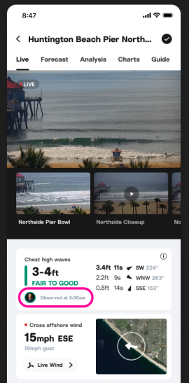
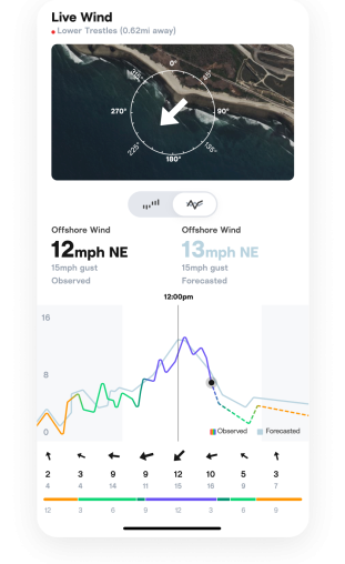
Live Wind

November 15, 2023 / Back to top
Get real-time wind data straight from the beach.
We’ve made improvements to Live Wind.
Ever left your house thinking the wind’s going to be offshore and the waves glassy, but you turn up and it’s blown out? Yeah, us too.
Wind strength and direction often makes the difference between a fun session and a wasted trip to the beach. Our Live Wind feature—available to Surfline Premium members—helps you make the decision to surf with the confidence it won’t be victory at sea.
Over the last few years, we’ve installed weather stations near surf spots all over the world that send wind observations straight from the beach to your app. Live Wind gives you accurate, real-time wind data from as close to the surf as possible, allowing you to easily assess conditions leading up to your surf.
To date, we have over 300 spots with Live Wind, ranging from California to Portugal to Australia.
Understanding Live Wind
If a location has Live Wind, on the spot page you can click on the Live Wind label to view even more information:
See the distance between the weather station and the surf spot in the sub header.
Explore map and graph visuals to see how the direction of the wind impacts the surf and how it changes throughout the day.
Compare observed wind to forecasted wind.
Live Wind means better forecasts too.
Historically, our wind data came from forecast models, and just like waves and weather, wind cannot always be predicted with 100% accuracy. Wind is especially challenging to forecast for specific surf spots because of local geography such as mountains or valleys.
Getting more precise wind data leading up to your surf is not the only benefit of this feature. Live Wind observations help us fine tune the surf forecast for the rest of the day as well.
What’s next for Live Wind?
We’re continuing to add weather stations around the globe. If Live Wind hasn’t made it to your local spots yet, feel free to let us know at support@surfline.com, and we’ll do our best to make it happen.
June 26, 2022 / Back to top
It’s the little things.
Surf ratings every hour, at every spot.
If you’re like us and obsessively check the cams each hour, you probably notice that conditions change rapidly.
We’re excited to roll out more detailed ratings which assess conditions every hour, at every spot, taking into account swell, wind, and intricacies of that particular spot. We apply a machine learning algorithm that uses years of Surfline data to indicate surf quality at that spot (and for that hour).
Use the bar at the top of the report to determine what conditions will look like within the next few hours, so you can more easily pick the right window to “take your lunch break,” “water your neighbor’s plants,” or whatever other excuse you tell your boss when you go surf.
June 26, 2022 / Back to top
Spot the info you need faster.
Spot pages have changed.
We’ve reorganized spot pages to help you find exactly what you’re looking for more easily.
Is now the right window for a surf? Check the Live tab and view real-time conditions. Want to plan a session for later in the week? See the Forecast tab to pick the best day. All the surf info you’re looking for—like our expert swell analyses, wave height, wind, tide, and water temp—is still right where you need it.
June 26, 2022 / Back to top
Keep it real in real-time.
Live cams from a new perspective.
No need to drive to the beach—get a real-time window into live conditions with our new cam player. With multi-angle views, our live cams show you exactly how conditions look from different perspectives.